200% Usability Increase
Optimized customer experience, mapped and integrated complex customer journeys across platforms
Contents
Executive Summary
Case Details Walkthrough
1. Align
2. Define
3. Design
4. Refine (and Deliver/Deploy)
Key Success Outcomes
Executive Summary
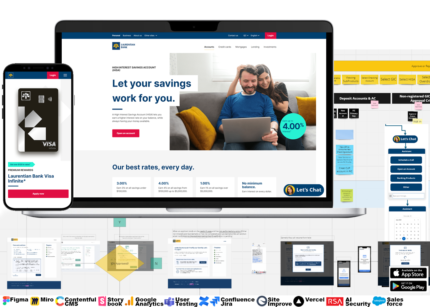
This project was multi-year complete end-to-end Public Website Re-design (and the first project on a new cloud based infrastructure) for Laurentian Bank of Canada, serving millions of customers.
It is the “face” of the organization, with specific needs for product information for specific provinces. It covered all the products and services for customers, information and “how to apply” for different types of accounts. It had to integrate seamlessly with other micro-sites, as well as a gateway to the online banking and mobile apps (iPhone iOS, Google Android).
- Company: Laurentian Bank of Canada
- Project Budget: $1+ million
- My Role: Rare background as Dev + Business + Systems Thinker = Dual Roles: (1) Lead UX and Service Designer (2) Co-Product Owner
- Business UX/Service Design Challenge: Make an experience as easy as engaging on Xbox, buying on Amazon, transacting with PayPal
- Platforms: Responsive Web, iOS, Android, Google Analytics, Contentful CMS, Vercel, Storybook, RSA IAM, Salesforce
- Business Units (10+): Product, Product Marketing, Customer Analytics, Account Management, Digital ID, Fraud, DevOps, Call Center, more ...
- Agile Pod Team Members (10+): Visual Designers, Developers, Content Writers, QA, Data Analysts, BAs, Legal, DevOps, IT Security, more ...
- Work Environment Challenges: Regulatory environment during fully remote COVID lockdowns (added challenge of building a UX/UI team)
Project Innovations - Digital Transformation Business Goal Achieved
- 20% yearly increase in the number of New Digital Customer accounts
- 20% yearly cost reduction in the Call Centre and in person customer
- 20% yearly cost reduction in inefficient operational support
The User Experience had to be designed and thought of as a gateway to a set of services, with multi-organization stakeholder purposes, to serve as a single and up to date point of reference; it needed to reduce information overload for customers, branch staff, sales staff, call centre staff and others.
This was a 4 Breakpoint Responsive Re-design and Re-launch (Responsive Web, Tablet, Mobile), on a new Web Technology Stack Infrastructure, to create and support the following Product Categories/Pages:
- Checking Accounts, Savings Accounts, Credit Cards, Loans, Mortgages, Insurance, Small Business, Investor Relations, Products & Payments, Human Resources (Careers), Contact Us, Geo Location Maps to Branches and Kiosks/ATMs
Process:
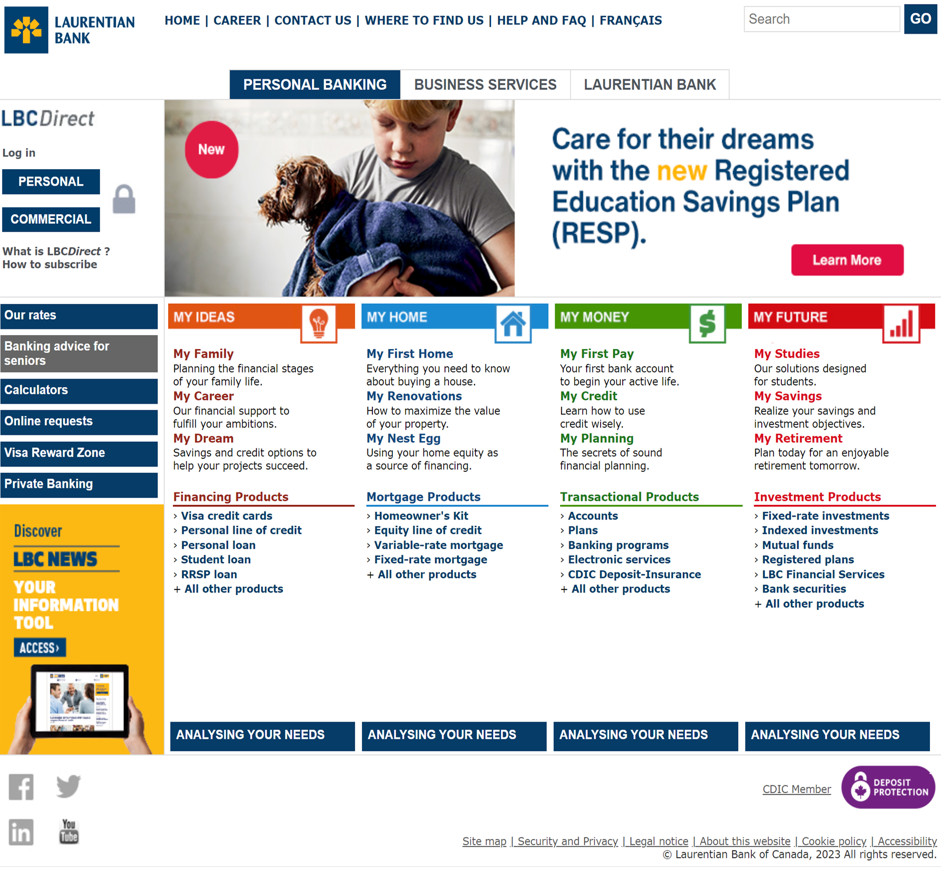
UX Before - Broken Experience
Users can’t do simple tasks as they have to go to different areas of the site, getting frustrated.
- Cluttered, confusing, Flea Market approach
- Feels like a slow “Terms and Conditions” site
- Based on how the Organization sees itself
- Difficult to find what looking for
- Key info buried deep, scattered across site
UX After - Seamless User Centered Experience
Users are intuitively, successfully guided through their tasks and can happily go on with their day.
- Clean, organized, Modern Storefront approach
- Feels like fast a “Personalized App” site
- Based on how users make decisions
- Intuitive, easy to find what looking for
- Key info surfaced, together in the right spots
Key Success Outcomes
Project Innovations
- Digital First UX/UI, Year 1 of Digital Transformation
- New User Centred Page Design and Design System
- 1st Mapping of User Journeys for all Products
- Integration with new Full Stack Infrastructure, CMS
- Fully Responsive Templates, Ops Process, new Tools
Scroll for more
Case Details Walkthrough
Getting on the same page
Often original business case goals at the executive level don’t have enough detail, or and too high level for the project team, as the many stakeholders have different points of view for what success looks like.
- On complex Digital Transformation projects, Senior Enterprise IT UX/UI experts incorporate a Service Design approach, which helps drill down and distill the key “aha” moments to get everyone “on the same page”, setting a strong foundation for alignment.
- While there are many Design Thinking tools, the following tools were instrumental to create a “bespoke” set of strategic guard rails to ensure the project’s success.
- The following tools were chosen and approved by the project sponsor, a combination of “Best in Class” from industry leaders such as IDEO, IBM, Neilsen Norman Group, Deloitte, PWC.
Align: Competitive analysis, "Art of the Possible"
Showing different competitors and best practices helps orient Agile Pod stakeholders who are not used to starting with a "blank page".
- Great Design Thinking facilitators are skilled at creating an atmosphere about sharing pros and cons, to help team members get into a shared Agile mindeset, and builds by having everyone get on the same page and share expertise in a collaborative and inclusive workspace.
-
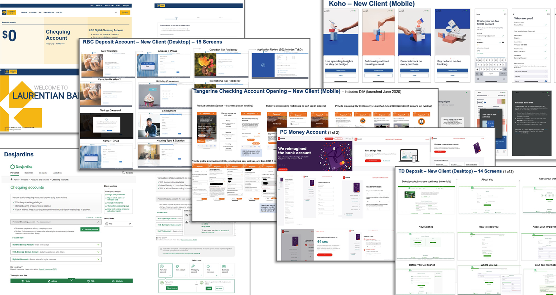
Best practice screenshots of leading competitor's experiences to stimulate design and lateral thinking, to help visualize target state goals
Align: Persona/Profiles
Personas and profiles are drawn from real research data, to visualize the types of customers, their wants, desires and Pain Points.
- As these were the first real set created for the bank, this helped created trust with the project team, and helped understand the gaps as well as the value and need for Design Thinking.
- By having real artefacts and deliverables in workshops, the project team was able to get Enterprise legitimacy and visibility, with greater participation and more detailed information from cross-department stakeholders who found an intrinsic desire to share in the project successs, and remove future roadblocks.
-
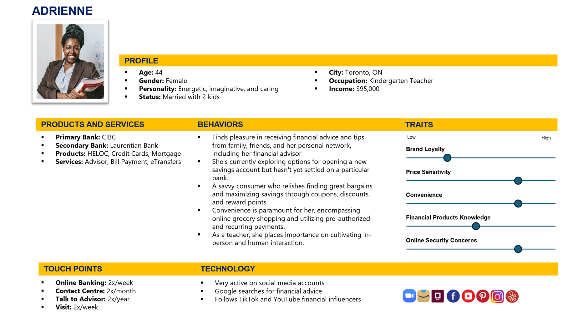
Sample of one of three customer segments to focus feature prioritization and KPI business value targets
Align: Current State Journey - Early Service Blueprint
Current state journeys provide insights into customer pain points, operational inefficiencies, and opportunities for innovation, enabling organizations to enhance customer satisfaction, streamline processes, and drive strategic decision-making
- A detailed mapping of the current state customer journey helped the project team move from a traditional "quick fix" mentality, so they can intrisically and empathically understand the problems and paint points customers have.
- By using a detailed "Jobs to be done" framework and showing the hundred plus steps for tasks, the project team was able to understand and think about how to buy-in for a more integrated view, and "see over the horizon" to help breakdown traditional silo thinking, as well as have more shared agency for a successful outcome.
-
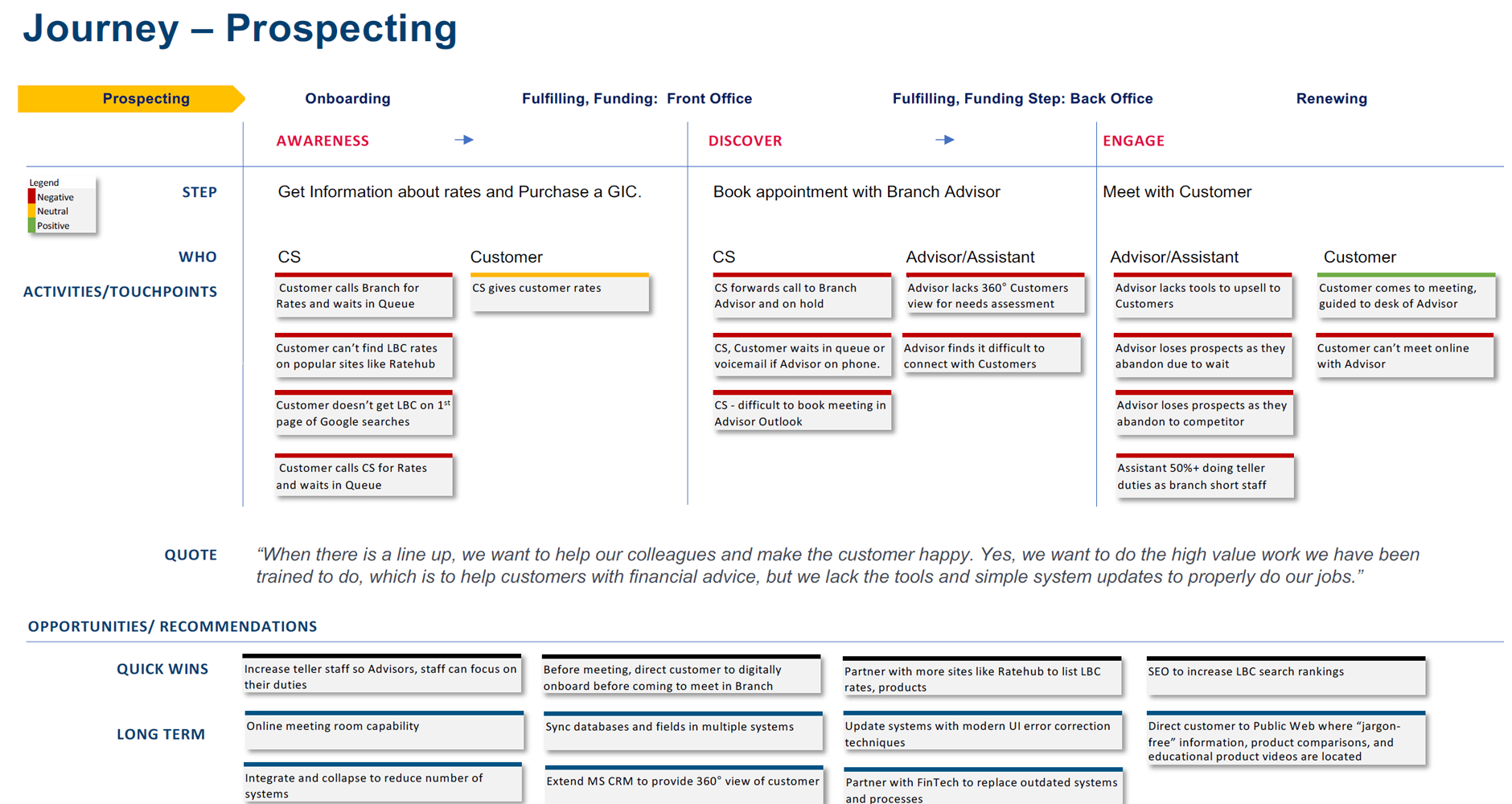
Sample step in a Customer Journey, used as input into the final Service Blueprint
Align: Other
Google Analytics
User Surveys
Current State User Testing
Define: Stakeholder Mapping, Epic/User Story Prioritization
User story prioritization and Epics optimizes resource allocation based on customer value, while stakeholder mapping ensures alignment and effective communication among all involved parties.
- In Design Thinking sessions, user stories were created on Miro whiteboards, to make it easy to identify and organize into Agile Epics; this is also useful so Stakeholders can map out Backstage activities for the Service Blueprint.
- This technique made it easy for Stakeholders to understand how their features relate together, as well as undrestand the scope and constraints, and ultimately be able to align KPIs for real business value.
-
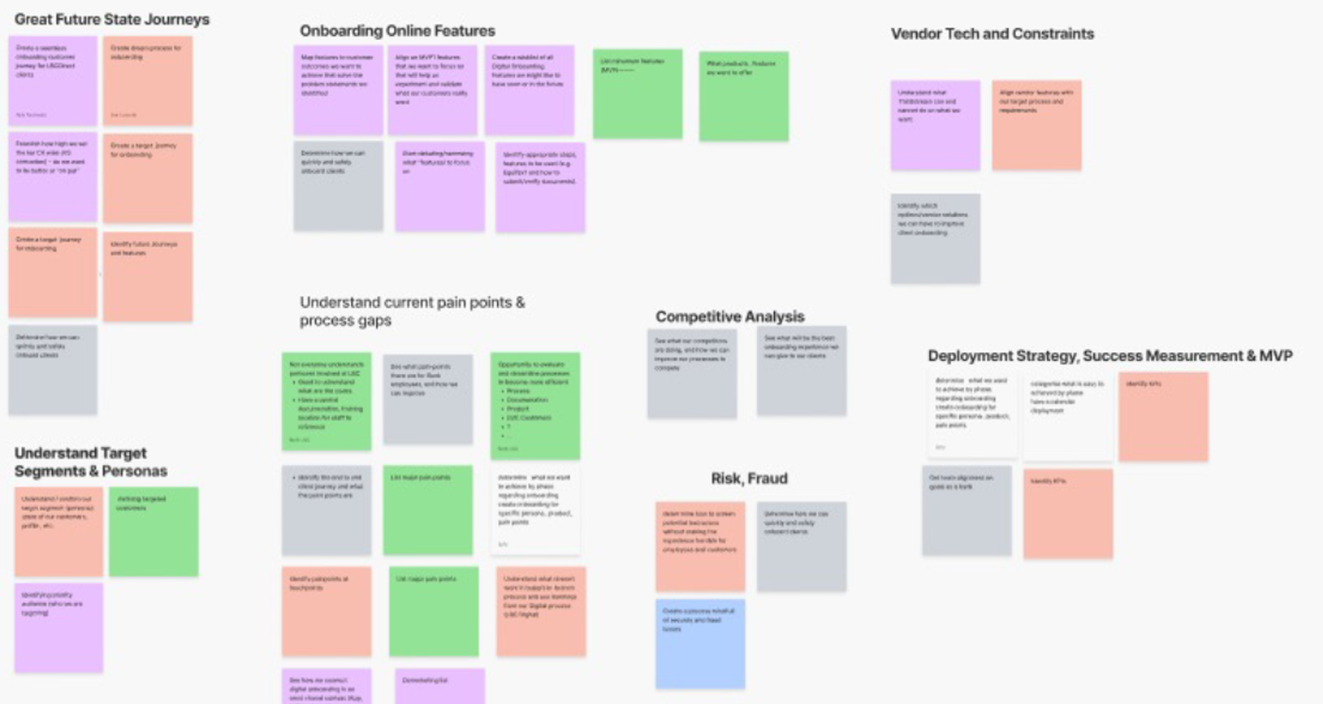
Sample Miro whiteboard for Epic feature prioritization, organized by Stakeholder group needs
Define: Idea Clustering and Impact Mapping Prioritization
Idea clustering aids in organizing and categorizing ideas for efficient analysis, while impact mapping prioritization focuses on identifying high-impact activities aligned with organizational goals.
- Together, these help drill down into more detail user stories for product features for Agile Sprint development, as there is a direct link to specific value outcomes aligned to customer segments.
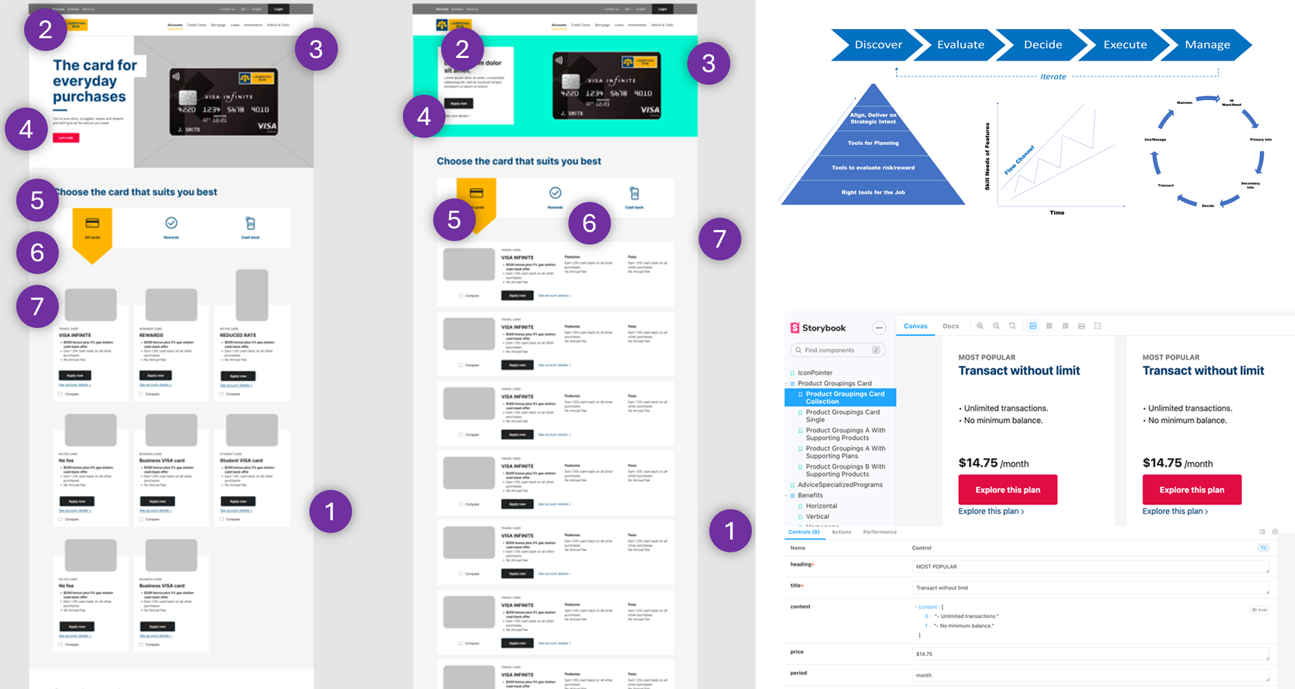
- These are organized based on customer purchase behavior and task steps of (1) Discover (2) Learn (3) Evaluate (4) Decide (5) Transact.
-
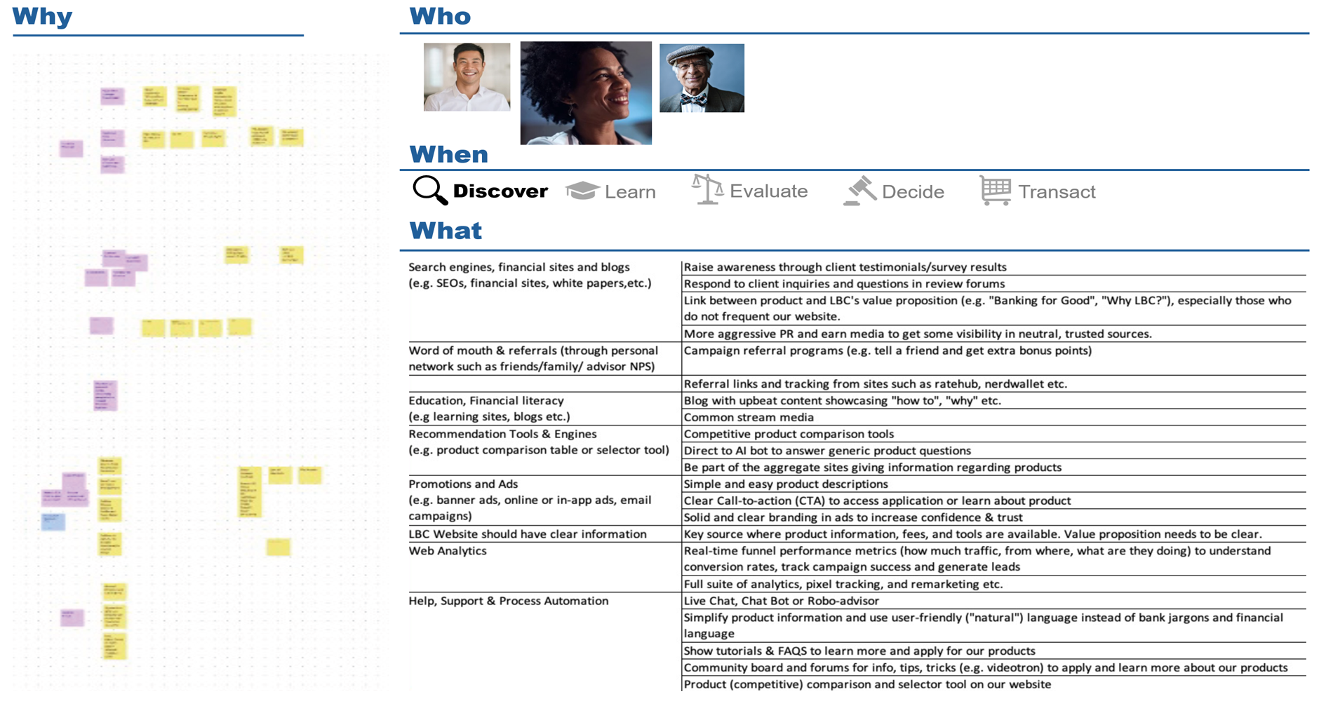
Sample Miro whiteboard of Idea Clustering aligned to Impact Mapping of features and customer segments (confidential KPIs removed)
Define: Technical Constraints - Platform Architecture
Understanding platform technical constraints is crucial, especially for Enterprise UX teams to ensure that design solutions are feasible to implement within the limitations of the platform, resulting in a seamless user experience.
- As this Digital Transformation project had a new Full Stack infrastructure, to replace the legacy systems, my dev background was key for project success, that created a 90% efficiency process from Design, Sign-off, to Deployment.
- With the cross-platform team, with my background as an IT Architect, I created an integrated Full Stack Platform that integrated with Contentful CMS, Vercel Next.js/React Hosting, Akamai CDN, G4 Google Analytics, Algolia Search, along with UX tooling such as Figma, Storybook Design System, Jira/Confluence, and DevOps, for a seamless DesignOps to Deploy/DevOps system in Agile Sprints/Pods.
-
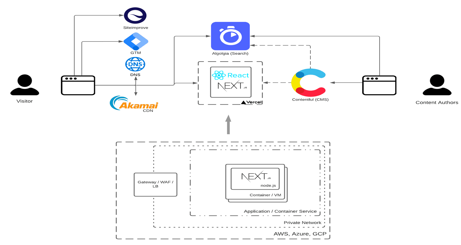
Architecture diagram to visualize/understand technical constraints, to align feasible design solutions with IT Service Blueprint needs
Define: Solution Cards into Confluence/Jira User Stories
Solution cards offer creative ideation and clarity for problem-solving features and their solutions, while Confluence/Jira User Stories provide a structured framework for implementation, ensuring alignment between innovative ideas and practical execution within Agile based Digital Transformation projects.
- Based on stakeholder prioritization, as co-Product Owner I created Solutions Cards and their associated User Stories into Confluence and Jira, for Backlog refinement/grooming to prepare for Agile Sprints.
- This was used for efficient ways as inputs for Agile Sprints to define and understand the scope of work, together with align of technical constraints of the new Digital Transformation Full Stack Platform.
-
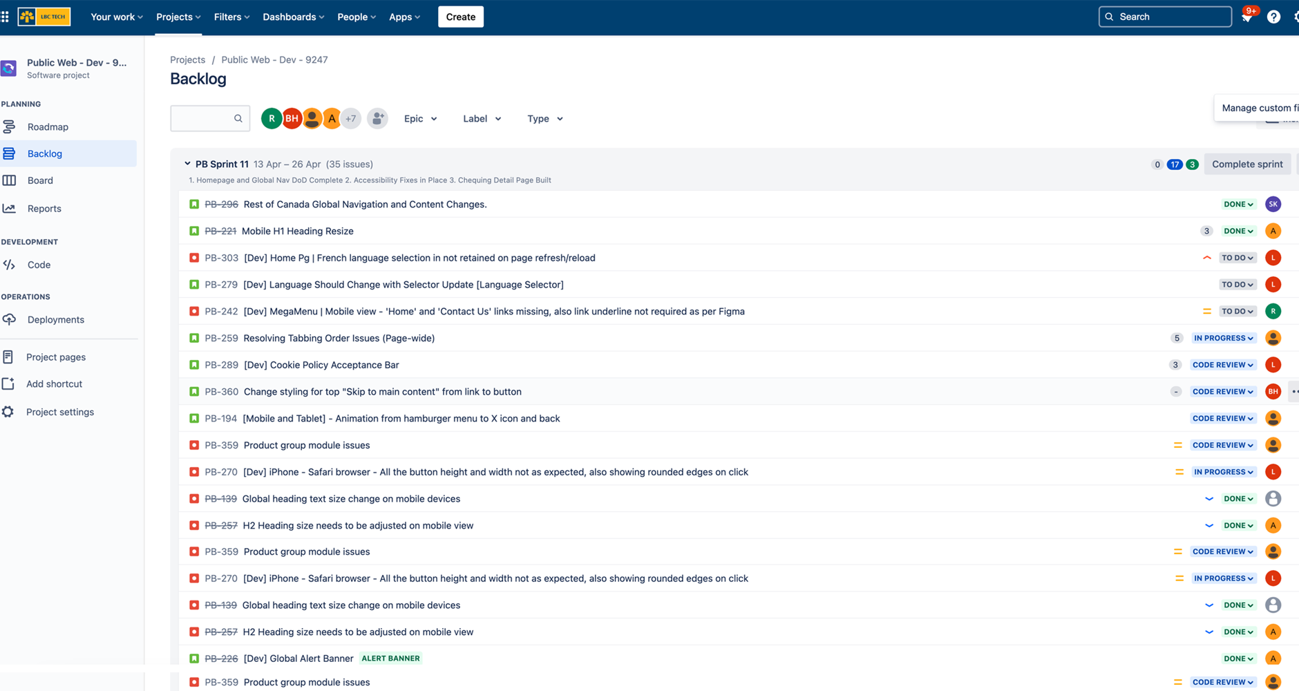
Sample Jira Stories Backlog from Solutions Cards, linked to Confluence, Figma, Storybook documentation
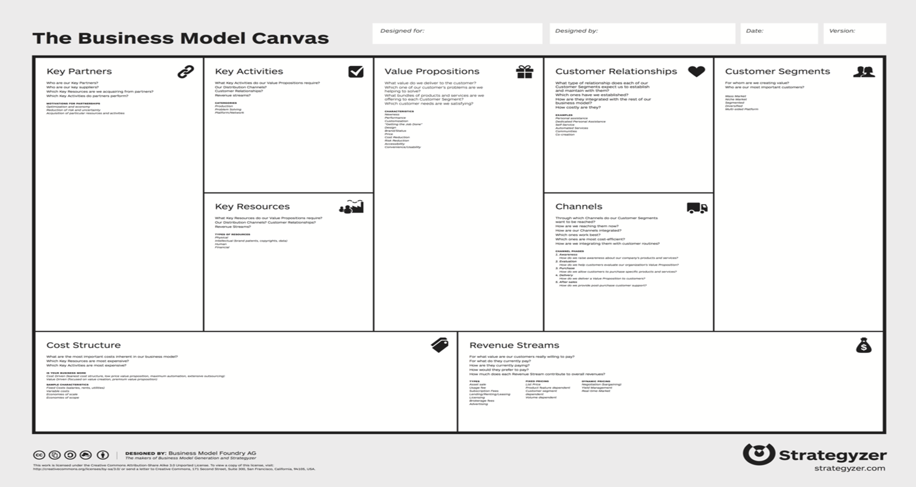
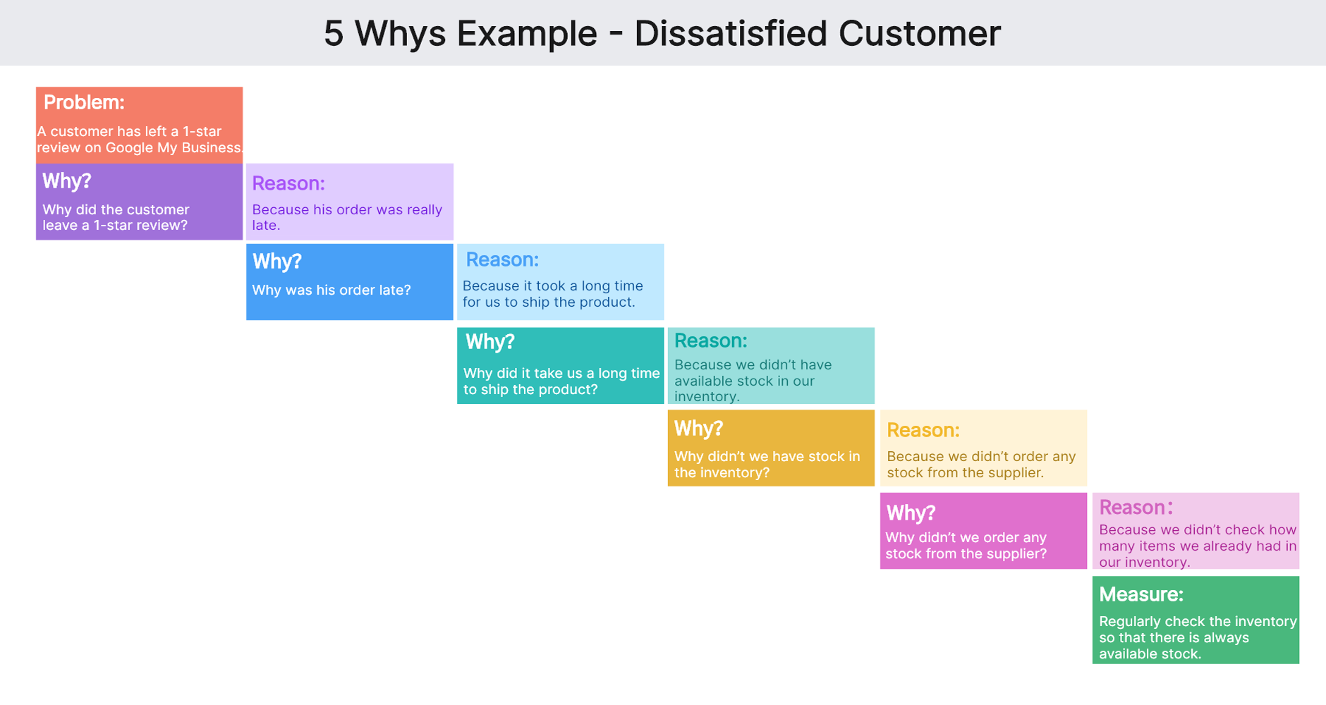
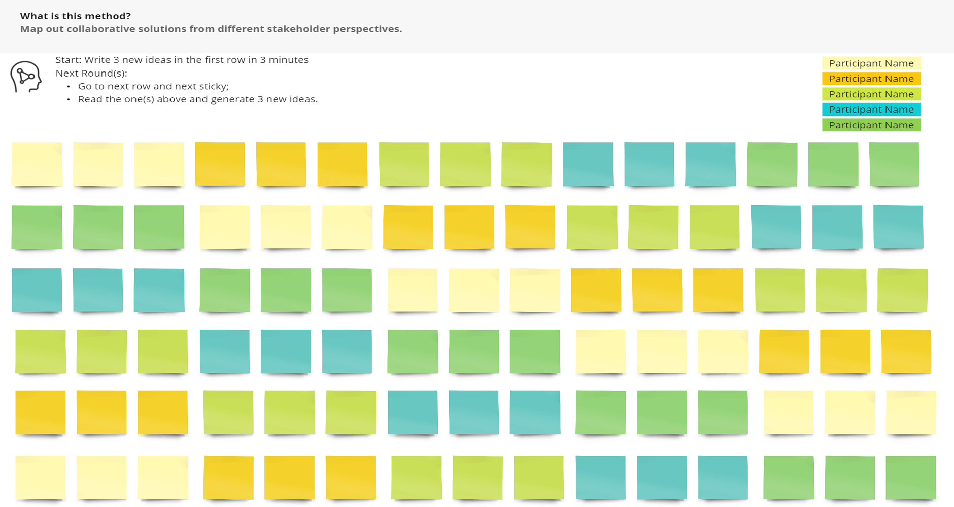
Define: Other
Business Model Canvas
5 Whys
How Might We Brainwriting
Design: Wireframe Prototypes, UX/UI User Psychology and Interaction Rules
Wireframe prototypes integrate UX/UI user psychology and interaction rules to create intuitive and user-friendly designs that effectively cater to user expectations and behaviors, ultimately enhancing the overall user experience; while
- Enterprise users are different from marketing or social media posts, so they need to have their layout and information specifically catered to how users think and go through tasks, which are capture both visually as Annotated Wireframes and with Interaction Rules in tools like Confluence and Storybook.
- An understanding User Psychology such as Fitt's Law, Miller's Law, and Csíkszentmihályi Flow State, are essential for success to have the right level of cognitive load and information density, as different products and their features need to be organized in different ways, as different producst are thought about in different ways by customers.
- Rather than generic page layouts, wireframes are created to optimized
-
Sample Sitemap, Screen Flows, Content Architecture Mapping for Enterprise Scaling
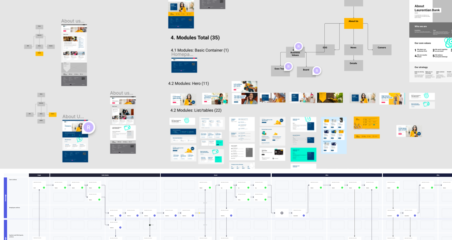
Design: Sitemap, Screen Flows, Content Architecture for Enterprise Scaling
Especially in Enterprise systems, it's important to understand the complete picture; along with Wireframes, Sitemaps and Screen Flows need to be aligned with technical workflow constraints using Content Architecture mapping, to establish a strong and scalable structural foundation, ensuring logical navigation, coherent user journeys, and organized content presentation for an optimal user experience.
- To visualize and help understand how to build solutions, Sitemaps and optimized Screen Flows were created to cater to each unique customer needs through to a Call To Action (CTA), covering 10+ products and business units.
- Aligning with the scalable Design System, these were mapped with a Content Architecture for the new CMS Content Management System, to be able to gain scale benefits from Design Pattern reuse, and ease and quickness for future iterative updates.
-
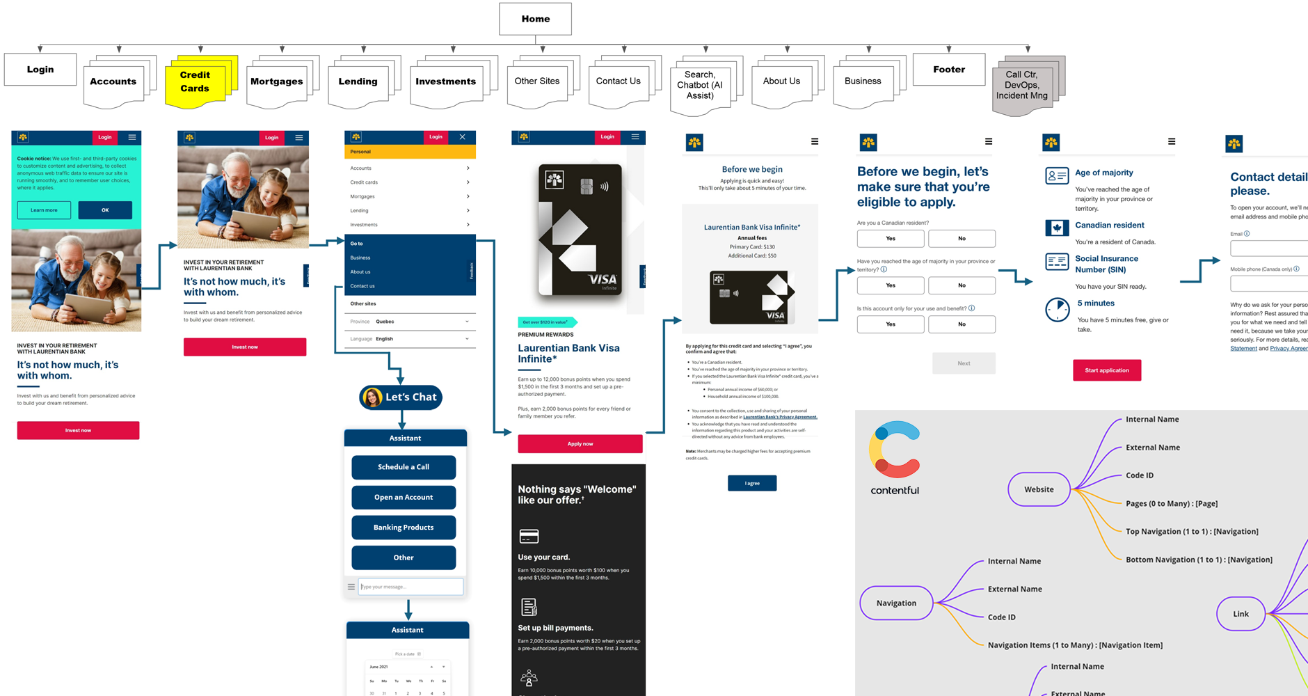
Sample Sitemap, Screen Flows, Content Architecture Modelling for Enterprise Scaling
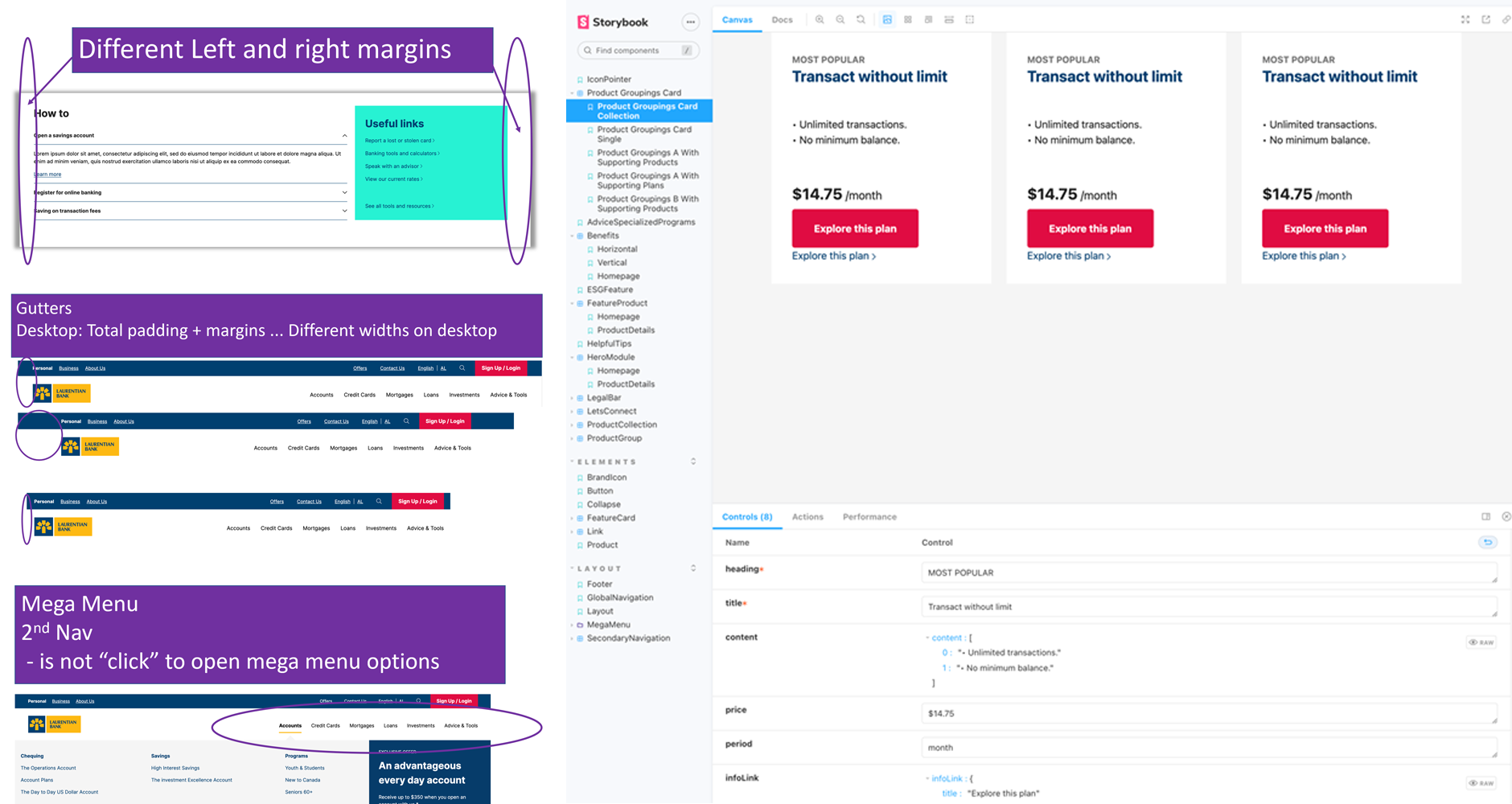
Design: Enterprise Design System
Enterprise design systems offer standardized design components, guidelines, and principles that promote consistency, efficiency, and scalability across products, streamlining development processes and enhancing brand coherence for a cohesive user experience.
- To be effective, it follows the micro to macro Atomic design principles, of (1) Element (2) Component (3) Module (4) Page/Screen
- As I build this, the first Design System for the Bank, it was scaled to be used by many departments such as Online Banking, Digital Marketing, Mobile Apps, Digital ID, Onborading, Call Centre Operations, and other 3rd Party Vendor applications.
- As a measurable KPI benefit, the Design System was instrumental to reduced new product launches in 3 months vs. 9 months.
-
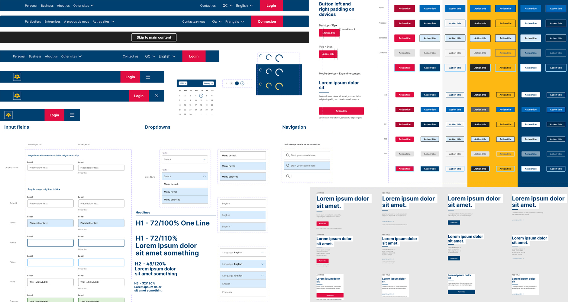
Responsive 4 Breakpoint Design System with Navs, Buttons, Text, Form Controls, Modules, and more.
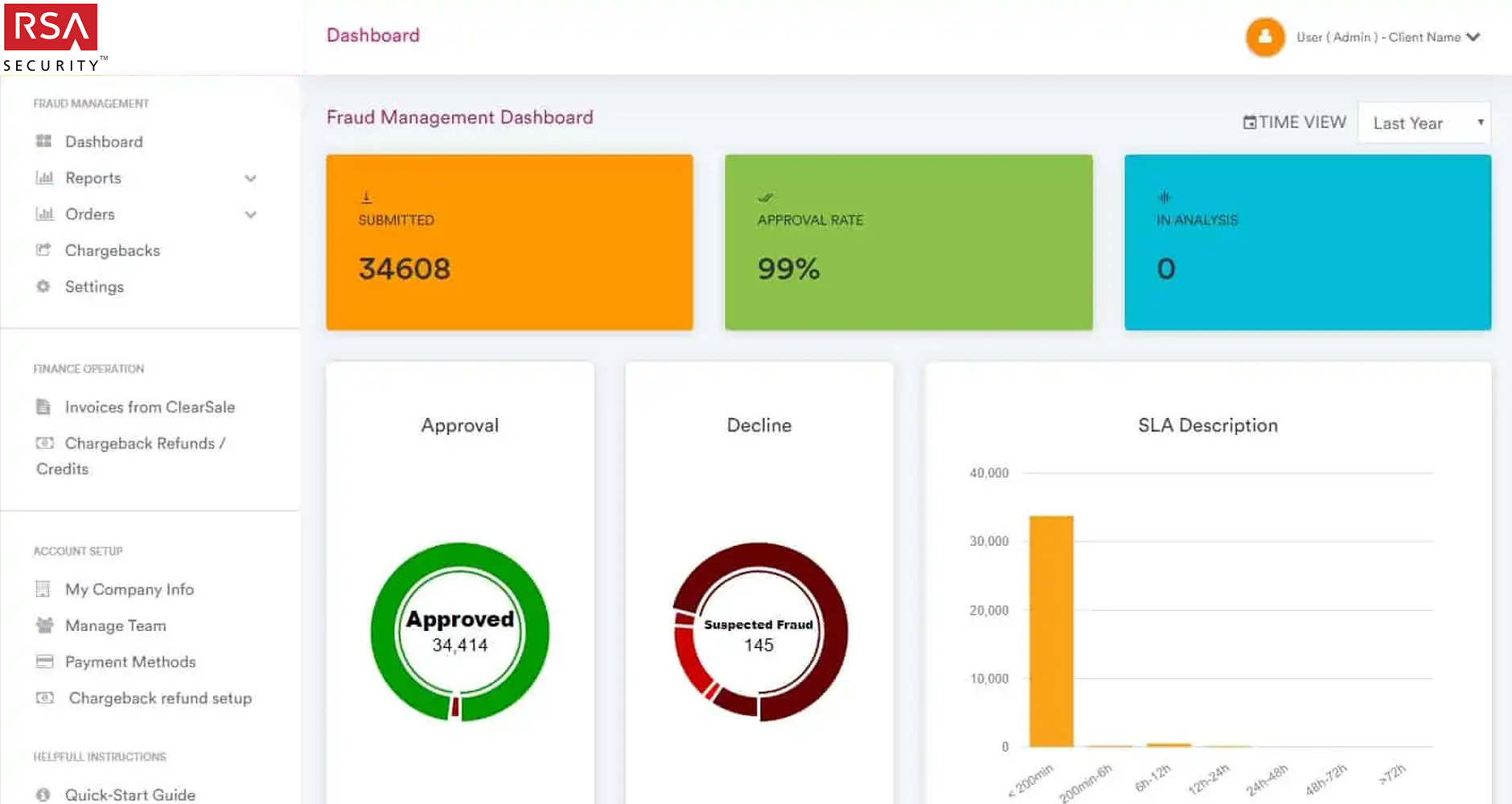
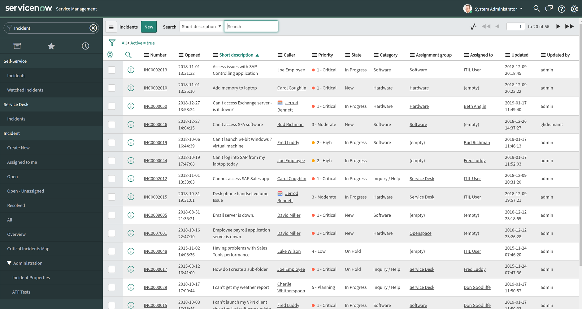
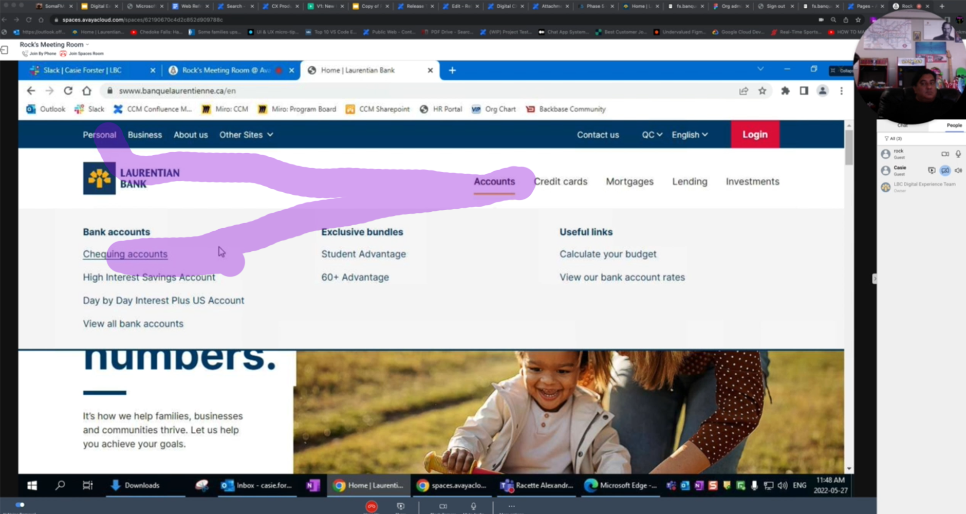
Design: Service Design - Call Centre, Incident Management, with AI
Part of the stakeholder Service Design Blueprint needed to include how to manage customer Call Centre Support, as well as incident management IT Support.
- Part of the goals were to remove duplicate Call Centre Content Management Systems, so the new site and infrastructure can be scaled for multiple uses.
- This was accomplished by updating internal support application UX, along with User Prompt Engineering modelling, so that specific content and user tracking can be make it faster to answer questions and make the issue resolution process less cumbersome.
-
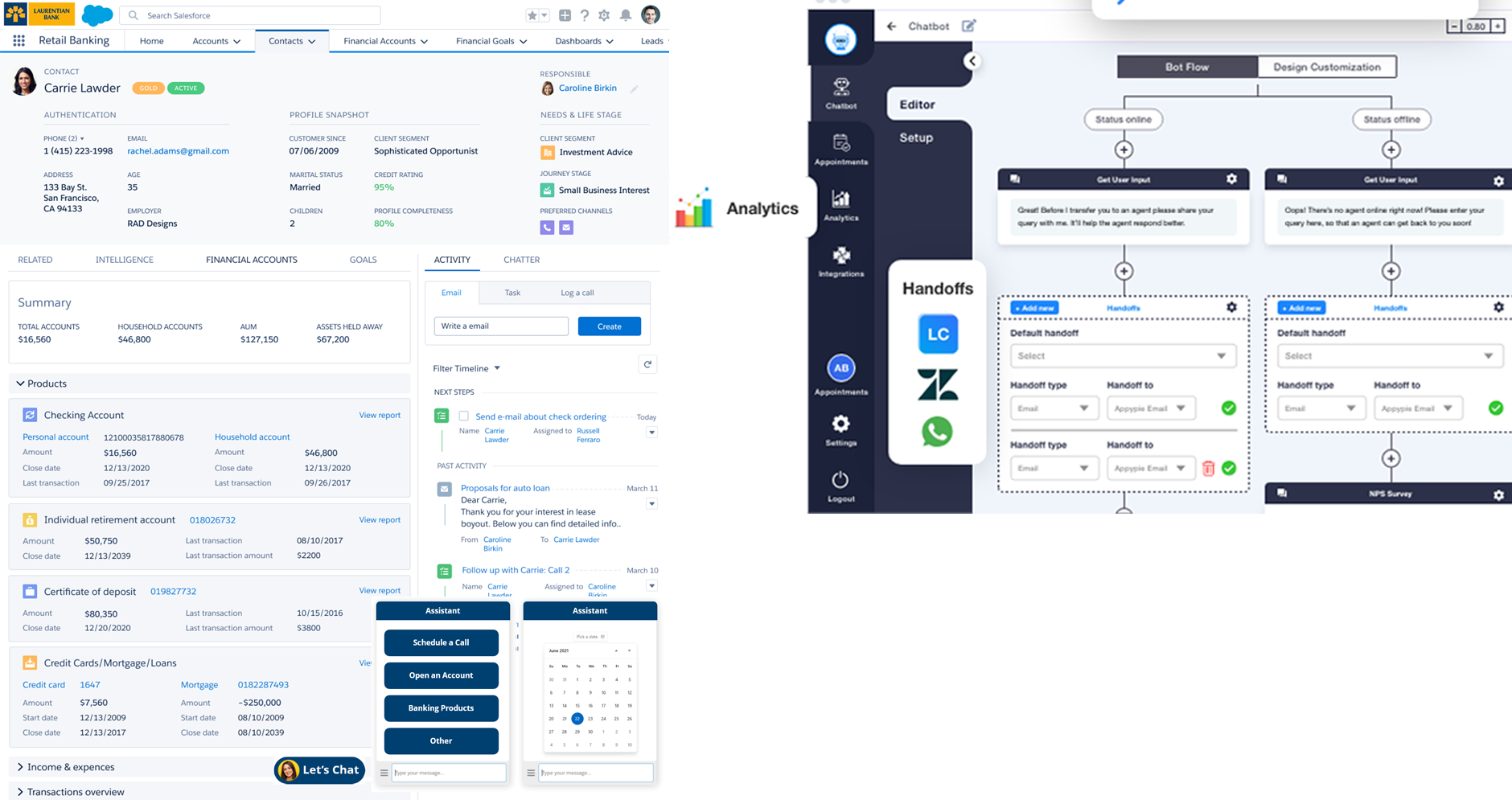
Call Center Updates for Customer Support, and Generative AI Chatbot Prompt Engineering Configuration, for Salesforce and ServiceNow integration
Design: Other
Splunk SecurityOps Worflow Updates
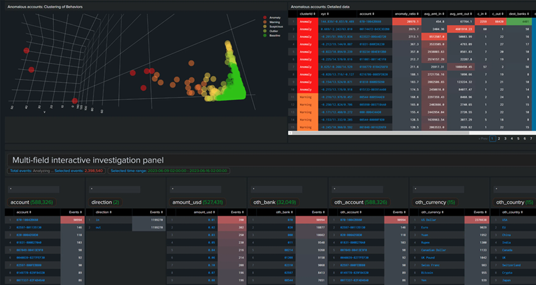
RSA Fraud Management Worflow Updates
Service Now Workflow Management Updates
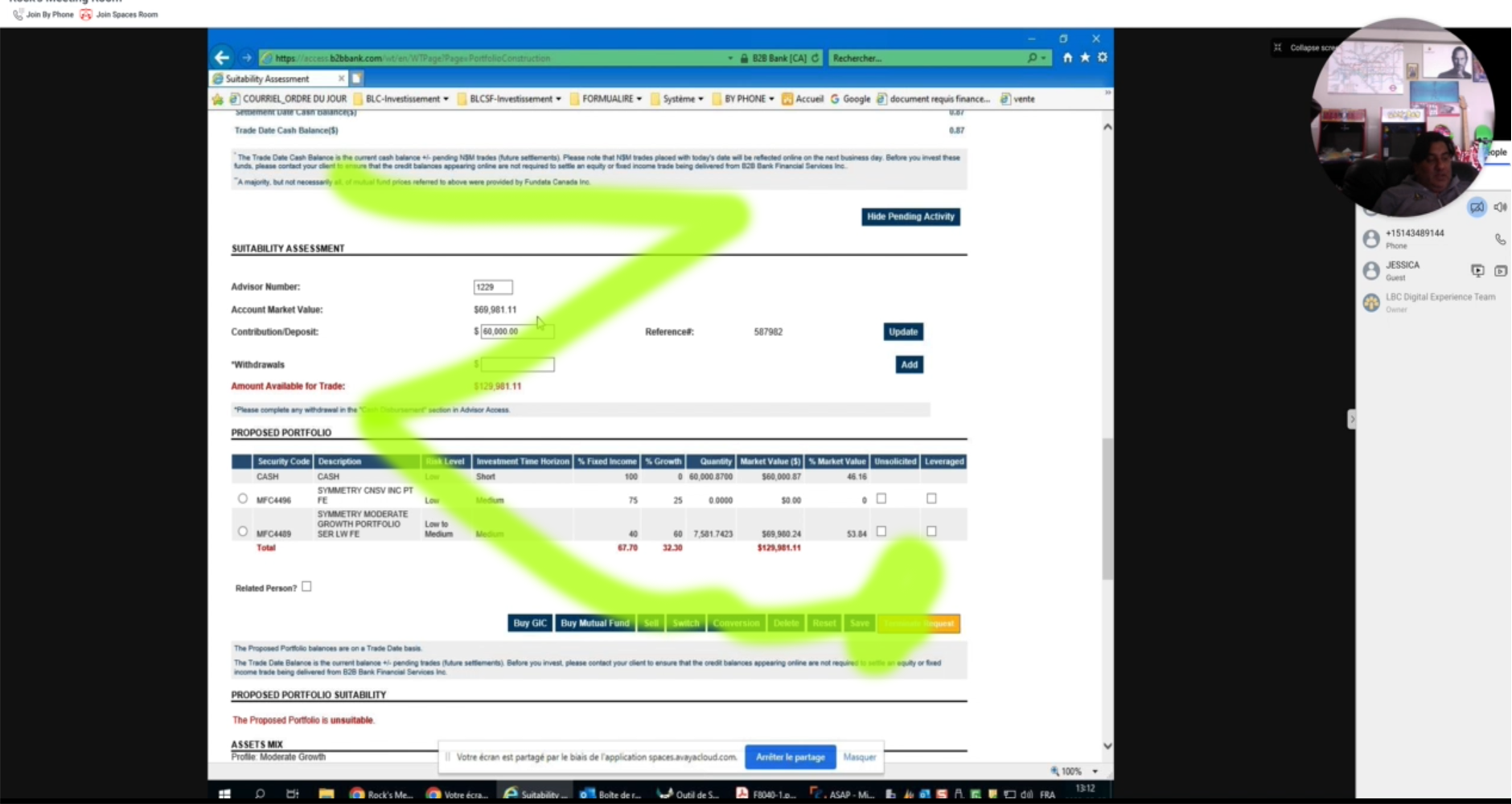
Refine (and Deliver/Deploy): User Usability Testing, Accessibility Testing
User testing is important to get qualitative and quantitative results to confirm the application is both usable and users are able to perform the tasks they need to do, to confirm business KPIs.
- Testing sessions were setup, to test specific tasks, to confirm layouts, screen flows, and CTAs (Calls to Action); this included users that have specific Accessibility requirements such as low vision
- 50 Users were able to successfully complete all 6 tasks within the time parameters, in both English and French language versions
-
1:1 Live Usability testing, task to find Personal Chequing Accounts - Recording with mouse tracking, successful time to complete in 10 seconds
Refine (and Deliver/Deploy): Wireframe Prototype Updates, Blueprint Updates
Outputs from Usability and Accessibility Testing need to be fixed in the main Wireframe and Prototype, and any workflow issues need to be updated in the master Service Design Blueprint
- Having all the UX artefacts aligned with the master Blueprint allows Development teams as well a Operations Support teams, so they can plan for the final deployment and Change Management activities across the organization
- In a regulatory environment, these final artefacts allow for traceability and reduce overall organizational risk
-
Sample of Wireframe updates, and refinements to master Service Design Blueprint
Refine (and Deliver/Deploy): UX QA, Systems and Training Documentation
UX QA and Documentation is crucial to be able to pass the final Agile Sprint exit criteria
- Automated QA tools are useful, but a final visual QA of screenshots with clear specific notes that are tracked in Jira tickets help take the final deliverables “over the goal line”
- Ultimately, all documentation of components, screens, and interaction rules are captured and updated in Storybook, so that developers can reduce Technical Debt and prepare for production ready deployments
- Documentation is used by other Business Units to train for any new workflow and Operational support Service Design changes
-
UX QA documented in Confluence and Jira, with Storybook Tools
Refine (and Deliver/Deploy): Final Deliverable
UX Before - Broken Experience
Users can’t do simple tasks as they have to go to different areas of the site, getting frustrated.
- Cluttered, confusing, Flea Market approach
- Feels like a slow “Terms and Conditions” site
- Based on how the Organization sees itself
- Difficult to find what looking for
- Key info buried deep, scattered across site
UX After - Seamless User Centered Experience
Users are intuitively, successfully guided through their tasks and can happily go on with their day.
- Clean, organized, Modern Storefront approach
- Feels like fast a “Personalized App” site
- Based on how users make decisions
- Intuitive, easy to find what looking for
- Key info surfaced, together in the right spots
Key Success Outcomes
Project Innovations
- Digital First UX/UI, Year 1 of Digital Transformation
- New User Centred Page Design and Design System
- 1st Mapping of User Journeys for all Products
- Integration with new Full Stack Infrastructure, CMS
- Fully Responsive Templates, Ops Process, new Tools